Due to the college magazine not having a contents page, I
decided to analyse a different style of contents page - Saga magazine and OK!
magazine. This will allow me to gain an understanding of why different layouts
and colours are used for different style magazines with different target
audiences to my own. Also, I will be able to explore the conventions of
contents pages and this will help me out when creating my own for the
preliminary task.
Contents
page analysis 1: Saga
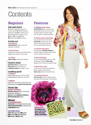

From first
appearance, this contents page gives the impression of a female target
audience, aged between 25 and 55. I have set this bracket because of the
various connotations projected from the images, fonts and colours. It is also
seemingly targeted at a sophisticated woman who is interested in clothing and
how they look. The images help to portray this target audience – this is down
to the styling of the model in the main image, her main appearance and also the
smaller images below. Moreover, the colour scheme and colour palate do this.
The magazines stereotypically epitomises the ‘ideal’ woman – a happy,
attractive, well dressed woman who is enjoying herself and isn't nervous or
comprehensive. These factors appeal to the given age group due to its
conventions alongside the connotations which I will note further on in this
essay.
The layout of the contents page is very self-assured – it
clearly knows its target audience and has laid out its contents accordingly.
The images, coupled with the attractive text and colour scheme work well
together because they draw the eye into the page and make you want to see more.
The producer has set the text in easy to read areas – this is done so that the
target audience can easily understand the page. It is laid out in a
conventional fashion in areas where it is coherent and structural. The features
on the page such as the block of darker colour and the line at the top
sectioning off a part of the text allow the magazine to be easily read and also
allow it to be attractive. The styling of the text and images fits the target
audience of the magazine as well as the colour scheme. A series of layout and
design features helps the contents page to fit the conventions required –
letting it fore fill its duties of informing the audience on what’s coming up
in the magazine while also being an attractive eye catching page. There are two
main columns on the page which allows the text to fit well while also being
attractive and legible. The ‘two column style’ is a common convention of most
magazine covers (as well as this magazine). It shares the same stereotypes that
as magazines such as vogue and many others with the same target audience –
hence the similar features.
Sticking to convention, this magazine has the ‘three main
colour rule’ – a rule where an often standard three main colours are used in
the form of a colour palate. The contents page’s three main colours are purple,
red and black and of course white, with it being the background colour. The
contents page works this rule well – fonts are fitted with specific colours
according to their importance and relevance, whereas the main image and smaller
images fit the scheme – white being the main colour of the woman’s trousers and
purple being the colour of the flower. This idea of a colour palate allows the
magazine to appear coherent, relevant and also appearing to the eye – the
layout style helps the colour palate to work because it is open and spacious.
This can also link in with the typography; font types are used which represent
the target audience; however this is only achieved to its maximum potential
with thanks to the colour palate. The colours relate to the target audience –
with perhaps more feminine colours being used to compliment the contrasting
nature of the white and black. The purple, light red and pink (on the woman’s
top) connote a female target audience; this is achieved by basic stereotypes of
colour coordination between gender and sexuality. The contents page instantly
connotes its female target audience due to this colour scheme which makes it an
essential asset to the layout and design.
This contents page houses 3 or 4 different typography styles
– these fonts are marked by being placed in coherent places, by being different
colours and also by being attractive to the audience. The font styles connote a
female target audience which is sophisticated and perhaps well educated. The
font ‘birth’ or separation space between lettering is conventional to the
magazine genre and target audience as it allows a lot of information to be
placed in a small space attractively. These appear to be the corporate fonts
used on this page, which helps to show off and build the brand – something that
will be recognised by the target audience. Despite all the fonts being
different, they’re all similar – they all have the basic textual style and work
well together – this is perfect for a magazine of this calibre because it is
professional and well organised. The typography is well constructed in terms of
placement and layout as it is not cluttered nor busy or untidy. This typography
gives off elegant connotations as it tries to fit the target audience; the
style helps it to connote a target audience in the higher social bands. The
typography relates to the target gender of the magazine as well as the target
age bracket – this is because of its feminine qualities and appeal to a higher
aged target audience. The typography could possibly be classed as ‘boring’ to a
younger target audience hence why it connotes an older target audience.
The main image – perhaps not a main connotation of magazine
contents pages, however one that works well – is a perfect platform for the
designer to work the rest of the page around. The main image is the reason for
the colour scheme, layout and design features as it is the first thing you see
when looking at the magazine contents page. The models clothing (mise-en-scene)
would have been picked in coherence to the page and the design layout would
have been though out at the time of taking to ensure it works professionally. Moreover,
the clothing is used to help relate to the target audience as well as send of positive
connotations regarding the target audience. The main image gives off, again,
sophisticated connotations which allow the page to stand out in terms of class
and design matter. Also, the page connotes that all women are happy, light
hearted, attractive people who are not self conscious nor have any qualms with
their appearance. The appearance of the model - in terms of mise-en-scene - in
this image is key; she needs to have a warming, inviting sense to her which
makes the reader want to see more. For instance, if the model was unhappy and
was perhaps not so attractive it may deter readers from reading on. This is
also the case with other magazines, Empire and Vogue in particular. Smaller
images on the page help to represent a larger target audience, trying to appeal
to more people. A flower is used alongside other areas of mise-en-scene on this
page epitomises the stereotypes and connotations often attached with magazines
aimed at this target audience. The smaller images connote interest in fashion
as well as wildlife and nature. These connotations allow the magazine to represent
its target audience and fore fill its duties as a magazine.
In conclusion, I think that this magazine manages to
represent its target audience and fore fills its purpose. It handles all of the
main challenges in a magazine contents page – it has an attractive layout, the
content is relevant and it fits its genre. The stereotypes attached help it to
portray a correct idea of its target audience alongside the connotations
created by the images, text, layout and colours. Due to its simplicity and
professionalism it is eye catching and fits the perfect ‘ideal’ of a magazine
of this genre and target audience. It is self assured and comfortable with what
it’s trying to achieve which makes it a perfect contents page to take
inspiration from.
Contents
page analysis 2: OK!


This magazine stereotypically epitomizes the average member
of the lower social grades – with a mass target audience of evidential TV
watchers. It is clear that the magazine is trying to appeal to a female target
audience due to the lighter colour scheme – made up mostly of pinks and
purples. Moreover, the main image gives off connotations of Laura Mulvey’s
theory that women are used solely of men’s sexual desire. The main target
audience is the bracket of people aged between 18 and 50 – this is because of
the television and celebrity theme. This group of people are most likely going to
want to read this magazine and be attracted to it due to its connotations.
Despite this, the main image may be in place to appeal to a male target
audience and try to attract a wider social class. This magazine is not targeted
at a younger target audience due to its content however perhaps a small
percentage of the under 18s would be interested due to its television and
celebrity orientated themes. The magazine’s contents page houses a selection of
images ranging between different topics and social interests so that the
magazine will find itself as one of the most desirable in the market place. OK!
magazine, similarly to Saga is aimed primarily at a female audience however due
to the social differences, shown through connotations from the images and text,
it means that the targeted social class is different to the previous magazine.
I will go on to explore this in further detail in this essay.
The layout is completely different to the previous magazine – there are many different images in this one of various celebrities
and TV personalities arranged to try to draw in and interest from their target
audience. Moreover, all of the images are shown as whole images, none are cut
out which also shows the genre of the magazine – models aren't used in a
studio, celebrities are used in action to portray their story in the magazine.
The textual layout style of a split page – one section for the main typography
and one for the main images – allows the designer to create two different
sections that the reader can concentrate on at a time – there is no confusion
over what text goes with what image for example. This also shows us the
targeted mental age of their audience as the magazine is very easy to
understand and read. Typography sections are clearly marked off by a thin line
which allows the magazine to have subsections where the eye can quickly adjust
to. The contents page uses a reverse to make text and images stand out
where required – this makes easy reading for the target audience. Images backed
with a white surround allow them to stand out and become more noticeable which
is why the layout style and design is so attractive to the eye. The colours,
typography style, mise-en-scene and also layout appeal and attract the target
audience as it has a very feminine feel and vibe. Due to the page being
attractively simple it doesn't require a huge amount of text – the message of
the magazine can be clearly shown through the images as well as the colours and
the bold sections of text. It is easy to understand and more important stories
are 'favourited' by the editor and selected so they have priority over the
others. This is imperative for the magazine as it allows it to be best suited
to the target audience and also keep them interested and involved.
In addition
to the previously analysed magazine contents page, this one also has a basic
rule of three, with white once again being the background colour and also the
colour used to make bold page numbers stand out. The rule of three – or colour
palate – in this instance is pink, purple and black – with two slight
variations of purple being used. This connotes a female target audience and
also helps to set a ‘girly’ kind of theme. This best appeals to the target
audience because the target audience in question often likes to have something
that they can relate to and enjoy looking at. Moreover, this makes the specific
images and text stand out and be noticed at first glance of the page. By having
a purple border edge at the top of the page it helps the eye to be pushed
downwards towards the text and also the main image – this design technique
helps the page to look attractive and also bring out the main image. Unlike the
other contents page, this one’s colour palate doesn't relate or fit with the
images on the page. The colours are used by the magazine because they are the
corporate colours as well as creating a ‘haven’ perhaps for the female viewer.
Furthermore, because the images were not taken in a studio it is harder to find
attractive images which send out the correct message to the reader, look
appealing and also fit the colour scheme. Opposing colours are used over each
other so that the typography is easy to follow and the target audience can
clearly follow the flow of the magazine and aren't put off by unclear text.
Finally darker shading is used at the right hand side of the page so that the
eye can be drawn further in to the centre images and text. This also is used as
a design technique which makes the page look attractive and professional.
There are a few different typography styles on this contents page which
gives it variety and makes it interesting to view. Despite the fonts being
different they all follow the same kind of style so that the page look smart
and in coherence. The main difference in the texts of course is the main header
which reads ‘inside’. This font style is always going to be different due to
its nature and because of its use as a corporate font. All of the fonts are
laid out in a conventional way which helps the target audience to read them.
They’re set out where there is a main sub heading, followed by text explaining the
page – this is done so that not only does it look attractive but the target
audience can have an idea on what to expect from the page. Sections of the text
have been made bold so that they stand out and the reader can be drawn to key
words which will appeal to their interests. This makes this page a crucial section
to the magazine as it is the make or break section as to whether the target
audience are going to read on or not. The typography styles fit the genre and
make it an attractive product to view – not only this but the content of the
text is relevant to the target audience which makes it a fantastic piece of
work by the editor. Despite how the magazine’s contents page relates to the
target audience and works coherently with the layout and design, the idea of
having a reverse to make texts stand out is perhaps not quite used to its full
potential in one section. This section on the main image where a white coloured
font is used is hard to read and doesn't stand out from the background.
However, I do now feel that this detracts from the contents page as a whole in
terms of quality and appeal to its target audience, as in stereotypes the
reader would perhaps only be interested in the page’s content rather than how
easy or hard the text is to read – maybe that’s just a bonus on top of the
gripping content. The typography appeals to the target age category as well as
the target audience of main females. This is due to the typography style (with
it being main feminine related texts) as well as the colour of the fonts.
Images are
used widely in this magazine contents page as it appeals to an audience who prefer
to take information in through visual means such as images rather than textual
means such as articles. The images paint the picture of the contents page for
the target audience as topical images help to portray the content of the
magazine. Text perhaps isn't needed for some viewers as they can clearly see
what they want to read and what page it’s on merely by the images and page
numbers. The images have been chosen carefully so that they can create the
correct connotations for the target audience. Current stories and talking
points are highlighted by the images and this makes the audience interested and
involved. Different shot types have been chosen to add a sense of variety to
the page so that it is appealing to view and also so that it is relevant to the
image. The images help to portray the genre of the magazine and also they clearly
help show who the target audience is. The different topics of images connote
that the magazine is interested in various current topics and television programs
as it portrays different genres through them. The different genres of image
pull in a mass target audience due to the variety in culture and interest – for
instance the magazine would probably not be financially viable if it were to
just show one genre type. The jewellery worn by the woman in the main image
connotes a sense of class and perhaps something that the female audience can
relate to – alongside the colour scheme. Moreover, the content of all of the
images is almost all female based – with not only the majority of the people in
the images being female, the content is mostly female related. This finally
helps the target audience to feel at home and perhaps comforted as they view the
magazine. It helps to keep the target audience interested, due to the female
connotations, and it also keeps the flow of the genre and themes.
In conclusion, I feel that this magazine fits its purpose fantastically –
the target audience is represented to the best of its ability and all of the
common conventions of this genre of magazine are represented. The contents page
shows off its target audiences’ interested well while also sticking to the
stereotypes attached with them. The page shows the main focal pints of the
magazine which is imperative to its success in the market place. Despite it
being a very different magazine to Saga, OK! portrays similar features and
ideas to a similar target audience.
No comments:
Post a Comment