Thursday 24 October 2013

Researching Mise-En-Scene For Photographic Shoots

I have chosen this video so that I can explore further and expand my my skills involving mise-en-scene and in particular, make-up. This tutorial explains how to apply make-up before a photographic shoot and how to make it look professional. The tutorial explains techniques such as how to apply foundation, eye liner and also lipstick. These are features which will allow me to make my model appear to the highest possible standard and also create a professional effect.

This tutorial has taught me how to apply make-up in such a way so that it looks professional and as if it would in a professional shoot. Some of the techniques it has taught me are the following: make-up primer, foundation, facial highlights, eye shadow, fake eye lashes etc. I now know how to apply these features and also what quantity of each is required for a professional effect. Moreover, I know what types of tool are required to apply each part of the make-up e.g. brush, pencil etc.


This tutorial is specific to what I want to achieve in terms of taking professional photographs as the kind of miss-en-scene created would appeal to my target audience. Moreover, this tutorial show an in depth analysis of the make-up application, hence allowing for an easy to follow video which in turn will let me create a professional-looking model.

For me as a producer, I feel that I would have to purchase high quality make-up to allow for a professional looking model - I will also need to purchase the correct implements to apply this. I may/may not require assistance when applying make-up so that I can make it look as good as possible. 

Following on from this tutorial, I will now practise these skills and techniques to create professional looking images with models which look correct for the genre. I now understand why it is important to have make-up which looks correct and professional.

I like this tutorial explaining make-up because it will guide me through creating my own images and making them look professional - it will also allow them to appeal to my target audience, represent the genre and also help represent the purpose of the magazine. Furthermore, the instructions in the tutorial are clear and easy to understand - this makes them easy to follow. Despite this, I do feel that the tutorial could go into depth into different styles of make-up which would in turn represent a different genre. This would also allow me to show a differentiation in my work. Moreover, this will improve my final product as it will represent my target audience and their requirements from a front cover design. This will also relate into Laura Mulvey's theory that women are used in media for the sexual desire of males.

Researching Photographic Techniques

The first video I have chosen to expand on my photographic techniques mainly focuses on lighting techniques and in particular the soft box. This tutorial explains how ad where to position the soft box and the presenter shows us how the octagonal soft box is used alongside other lighting.

From this tutorial I have learnt many different techniques and explored various ideas concerning use of soft boxes as well as lighting in general. I have learnt where and how to position soft boxes and also how to adapt and change the lighting depending on the subject. Moreover, the tutorial explains other lighting styles as well as the technique to use the soft box as a background for the image. 

Furthermore, the tutorial explains different poses for the subject of the image - it has allowed me to understand which positions look good and which look professional. I can now take these skills into my own photography when I create my own images. I will create a few 'tester' images to ensure that my understanding of studio photography is sufficient to create a professional pose. 

I like this tutorial because of the understanding gained through the topics and issues explained. Moreover, I have been able to build on my understanding of this area of photography which will in turn enhance my work. Despite this, I feel that the photographer could have explained certain aspects clearer regarding some sections of the lighting - this includes the instrument used to measure light coming through the soft box.


The next tutorial that I have chosen explain further the lighting used, the camera settings and also basic editing in Photoshop. The tutorial explain use of a beauty dish and various strobe lighting - this will help me vastly when taking my own images. The tutorial explains how to set up the lighting and where to place it. The tutorial then explains the camera settings regarding ISO, shutter speed and noise reduction (when editing the final images). 

From this tutorial I have learn about lighting used in professional studio shoots as well as basic camera settings, when taking images in a studio as well as mise-en-scene and editing. This will allow me to take professional images for my magazine cover and contents page and it has also allowed me to have a clear understanding of the background behind it. Moreover, I now understand why and where lighting is used and how it has an effect on the model. This is imperative for my success when taking my own images.

I like this tutorial because of the easy to understand, step by step analysis of how their images were taken. This tutorial also appeals to me because of the nature of the photographs taken - they are of a similar style to the ones that I will be taking for my magazine cover. I do however, feel that the photographer could have gone into further detail regarding the camera settings as this is an area which will help make my images look even better. 

These two tutorials have allowed me to understand how I am going to improve my work - I now understand the areas which I feel perhaps need a certain level of improvement. I will practise these skills in my own time to ensure that I can improve my skills and create work which looks professional and relevant to the genre and audience. 

These tutorials are specific to my final product as the both represent ideas in a studio background - hence showing me the types of skills required to create interesting photographs through use of soft boxes and camera settings. For me as the producer of this work I feel that I will need to practise these skills and fine tune them so that I can create professional images similar to that in the tutorials. I may need to overcome challenges such as cutting out natural light and setting up the lighting equipment in the first place. Once I have overcome these issues I would then be able to create perfect images.

Following on from the techniques I have learnt, I have had a photo shoot which incorporates and expands on them - this image has been took using lighting from a soft box. I have experimented with the shutter speed and other effects on the camera. This in turn has allowed me to create an image which look professional and in coherence with what's required in this genre. 

Researching Photographers

To gain further knowledge in terms of indie/alternative photography, I have explored Vikky Ivie's work to discover how and where images of this nature are taken. The photographs below represent my target audience and also represent the purpose of a music magazine hence why it is imperative that I explore these images further. These images will give me a clear sense of what kind of shot types I need, alongside the setting.

This image in particular represents the target audience through the shot type as well as the final editing. The images range from medium close-ups to long shots and extra long shots - this makes the images interesting to view as well as allowing them to represent the genre, audience and purpose of indie magazines.

These images have been edited in such a way so that they look old fashioned - this is maybe something that I want to do in my own images. Editing is a key part of this type of photography as it allows the images to represent the audience further through engaging filter styles. I may/may not want to incorporate this into my magazine - it will overall depend on the shot type, coupled with the miss-en-scene.

Ivie's work allows these images to represent the target audience in a number of ways - to begin they represent Laura Mulvey's theory that women are use in media for the desire of the male audience. Moreover, Ivie's images appeal to a female target audience through female desire to appear attractive and represent the 'indie feel'. 

Finally, I like these images because they are attractive, interesting photographs to view. Moreover, the photographer has used engaging models which represents key themes through miss-en-scene as well as lighting. I will create images which represent themes like this as it will allow me to produce images which represent the genre of 'indie'.

I will adapt the skills which I have learnt throughout this post to create images similar to Ivie's - I will do this through an experimentation between outdoor and indoor photography. This artist will improve my work as I now have a clear understanding of what kind of photographs looks good and what type don't. This will improve my work as I now understand what shot types look good, which filters may look good on my cover and also the kind of pose from my model which would look professional. 

This photography is specific to my work as she creates images that represent the key themes associated with the genre of 'Indie'. The photographer uses interesting techniques which appeals to me and my genre due to the interesting shot types and the edited effects on the images. I will try to replicate these techniques in my own work so that my images look professional and appeal to my audience. 


As a producer/photographer some of the possible challenges which I may have to overcome are the following: getting correct lighting in my images, finding interesting settings for my model to be photographed and editing my images to a high standard. I will also need to create a high level of muse-en-scene in terms of clothing and make-up to make my images look to the highest possible quality. If I can do this then my images will look professional, represent the genre, audience and purpose and they will become the focal point of my cover and contents pages - making them a high quality. 

Audience Research

Secondary research:
“Any media text is created for a particular audience and will usually appeal most to this particular target audience” (Hall and Holmes, 1998). This theory shows me that I will need to find out about my target audience so that I can represent them accordingly. Hall and Holmes' theory allows me to understand what makes successful media product and it allows me to understand how to represent my target audience. I am going to undertake primary and secondary research so that I can create a product which understands what my target audience want from a magazine and it will also allow my magazine to make a profit.


When I create my magazine I need to remember that the focal point of the industry is that it is there to make a profit. This shows me that every magazine in the industry is there to represent its specific target audience so that it will be as successful as possible. Due to this, every area of the magazine is effected, and will be influenced by the target audience. Every section of the production process is specifically adapted so that the specific target audience can be represented to the best of its ability. 

The key purpose of magazine is to gross a profit, because it is a money making industry millions and millions of pounds has been invested in audience research (primary and secondary) to help the industry pitch to and represent the right group for their product. Conglomerate institution such as the BBC and Bauber are experts at this and the know that it is more profitable to pitch to a mass audience, where by some independent publishers may make a more create product for a niche audience that has a higher financial risk.

There are two main audiences that you can pitch to - these are a mass audience and a niche audience. A mass audience is an audience which covers a large percentage of the population, appealing to their interests and desires, whereas a niche audience is an audience which only covers a very small section of the population. For example, 'Top of the Pops' magazine represents a mass audience - due to a large section of the population having an interest in pop music - and 'Indie' magazine would be targeted at a niche audience as stereotypically a smaller number of people have an interest in indie/ alternative music.

All magazine publishers do something called 'profiling their audience' - this looks at audience demographics such as age, gender, social status and their viewing needs and preferences. 

Magazine publishers think about the following questions when developing and creating a magazine:
1) What is the social class of the primary target audience?
2) What is the gender of the primary target audience?
3) What is the age of the primary target audience?
4) What is the nationality of the primary target audience?
5) What is the ethnicity of the primary target audience?
6) What is the sexuality of the primary target audience?
7) What is the audience appeal - what will the primary target audience be looking for in a magazine?
8) Is the magazine for a mass or niche audience and how will it create a profit?

I will now conduct my own primary research through use of Survey Monkey so that I can understand who my primary target audience is.

Primary Research:
I have created a survey using Survey Monkey so that I can gain an idea of the my target audience as well as see what features my audience want to see on a music magazine. I posted my survey on various social network sites so that my magazine could go out to a large audience and I could get a large number of results. Moreover, my target audience will likely be using social media which will fully ensure my magazine goes out through a relevant source. This will show me who my target audience are and what they want to see on my music magazine. 

https://www.surveymonkey.com/s/BF87KXK

After I collected results from Survey Monkey I evaluated my results - here is what I found out:


From looking at the graph of the results for my question 'Are you male or female?' I can understand that my survey is going to be relatively even in terms of representing my audience's desires through better demographics results. This is important because the genre is almost split 50/50 between the two genders and I will have a true understanding of what they want to see from a music magazine. 

My results show me that the predominant age of the people who took my survey is 17-19 years of age. This statistic shows me that the age of my audience is representative of the audience for the genre, hence allowing me to see their needs and desires. I also have a secondary target audience aged between 14 and 16 - I will need to think about this when creating my magazine.


From looking at my graph above, I can see that my target audience are in the social bracket C1 - with the secondary target audience of C2. This shows me that my magazine needs to represent this kind of audience through use of lexis, images and colour - this will allow my magazine to represent the audience correctly, allowing my magazine to succeed. Moreover, this will allow my magazine to connote the correct themes for the genre and audience. 

This question allows me to understand my audience's views and it will then allow me to show that through my magazine and also represent the target audience coherently. My target audience represents almost only white British - this shows me that the audience's views would be based around that of an average white British citizen. My magazine will represent the white British ethnic group and this will allow it to flourish in the market place.

From looking at the previous question I can see that the sexuality of heterosexual is mainly represented and is therefore the primary target audience. The secondary target audience is bisexual so I may want to represent them through the magazine to therefore widen my audience. This will allow me to understand my audience and portray their sexuality correctly. 

I can see from this question that 10% of my audience always read magazines and 20% read magazines - this shows me that there is still a marketplace for printed magazines. 

This question shows me that the majority of my audience want to see an indie/alternative magazine over other genres of magazine. If I were to try to represent any other genres my graph shows me that a secondary audience would be pop, rock and hip hop. This gives me confidence in my target audience and what they want to see from a magazine.

This graph shows me that interesting, professional images need to be represented on my magazine and this is what my audience want to see. I will also need to represent interesting colours, images of musicians and a catchy masthead. This will allow me to portray my audience's needs and desires correctly because this is what they want to see on a magazine. Moreover, it will help to portray the purpose due t the interesting images and colour. 


Audience Profile:

Using stereotypes and representation theory (secondary research) to sell magazines:
Professional institution who profile their target audience refer to themes of representation, existing products and audience research, which then allows them to understand what stereotypes they should interpret in order to attract their target audience. I will be looking at key theories regarding stereotypes concerning youth, gender, nationality, sexuality, class and ethnicity. I will be exploring how these theories can be shown in music magazines with a similar genre to that of the magazine which I will be creating - indie/alternative. This process will allow me to understand which stereotypes will help sell my magazine. 

To start, this magazine cover supports Laura Mulvey's 1975 Male Gaze theory which states women are used in the media as 'erotic objects of desire'. It does this through the use of Lily Allen on the front cover - an artists who is perhaps seen as an object of sexual desire, however this is intensified through the use of an erotic pose. Moreover, this theory is added to through the use of costumes in the form of mise-en-scene. The model is half naked which connotes sexual intercourse and an erotic nature. This in turn helps to sell the magazine through attracting a male target audience who want to see/read more about her. In terms of the lexis on the page, the term 'sexy beast' is used, which connotes eroticism and can attract a male target audience through stereotypes associated with the term. The magazine represents Mulvey's theory further through use of red and one of the main colours on the page, this connotes love, lust and passion and helps to back up stereotypes and themes associated with the main image and lexis. From looking at this theory, and also this example, I think that I may want to incorporate this kind of theory into my own work to ensure that my magazine represents my audience to the best of its ability.


The next magazine which I am looking at represents sexuality through a way in which is highly stereotypical for a magazine like this in the media. The magazine cover "chooses that aspect of gay male behaviour (SELECTION), inflates it into the defining male characteristic of male homosexuality (MAGNIFICATION), then establish it as the most easily recognizable image (REDUCTION).” This theory is shown on the cover through the use of mise-en-scene in the form of 'gothic' clothing, something which is generally stereotyped alongside homosexual males. This is done through make-up, long hair and black clothing - all of these on a male connote homosexuality and therefore represent the theory above. Sexuality is also represented through the lexis of this magazine cover, words such as 'veil brides' are used which connote femininity, something commonly and stereotypicallly associated and with homosexuality. Moreover, this is also doe through the colour scheme on the page, orange is used for example - perhaps a colour which may connote homosexuality. I have decided that I am not going to represent this theory through my magazine cover due to my target audience and their desires - I may however decide to incorporate it in somehow through the use of teasers.


My next magazine cover goes against Sarita Malik's 1998 theory which states “Many feel that Black and Asian audiences are still not sufficiently catered for and that insensitivity towards issues of race and ethnicity still exist. The reality of a lived multiculturalism is not represented in the British media." This theory is contradicted through the use of a black artist on the cover - this maybe however because Malik's theory is outdated and the situation in the media is slightly different now than what it was. Moreover, the use of a specific lexis on the page connotes happiness due to the use of the quote 'I'm spreading joy around the world'. This connotes happiness and goes against the theory which states 'Certain images of Black people as deviant trouble-makers, for example, are perpetuated by the media in order to encourage the mass audience to view blacks in a certain way'. This theory is not one that I will be incorporating into my own magazine when I create it as my primary target audience are white British, so this kind of representation would be unnecessary. 


This magazine cover represents Andrew Higson's 1998 theory which says that 'Identity is generally understood to be the shared identity of naturalized inhabitants of a particular political-geographic space – this can be a particular nation or region'. Despite NME being a magazine which is released in the UK, a US flag can still apply as it relates to the material inside and is also coherent in terms of relating to the audience of that particular artist. Nationality is conveyed through use of mise-en-scene in terms of the background image which is of the US flag - something which directly connotes the nationality which it is referring to. Moreover, the colour scheme, mainly consisting of blue and white also connotes this. The lexis helps to portray these themes also as it incorporates words such as 'modern American icon'. This helps to represent the target audience as it represents what they like from a magazine cover and also what they like in terms of genre of music. This theory probably won't be relevant for me when I come to make my magazine cover because the majority of people who read/enjoy that genre of magazine/music are primarily British, hence there not being a need for another nationality to be represented.

This cover portrays stereotypes concerning youth through Stanley Hall's 'Storm and Stress Model'. In this, he stated that the common mood of all teenagers is 'depression' and he also stated “Youth must have excitement and if this is not at hand in the form of moral intellectual enthusiasms it is more prone to be sought in; sex, drink or drugs.” Moreover, Bill Osergby stated “We do not have to search too hard to find negative representations of youth in postwar Britain. These two statements are represented through this magazine cover through the use of imagery and the star vehicles. This is through coloured hair and dark clothes - this also relates to Stanley Hall's theory of 'rebellion' in teenagers. These theories can also be shown through the use of black on the cover in the form of text boxes - this connotes depression and rebellion and also the use of half-naked men - something which can be related to both theories. This is certainly a theory which I will be incorporating into my magazine cover as it will help to relate and represent my target audience to the best of its ability. Moreover, it will allow the cover to convey as many generic stereotypes possible to make my cover realistic and professional.

Finally, my last magazine cover represents theories which relate to class and the social grades which are connoted through this. Marist's argument states that the middle classes have the best deal in terms of representation as it is the middle class who control the media. This is why magazines aimed at the social bracket B/C1 are catagorised as the 'social norm' (Gandal 2007). These theories are shown here through the use of mise-en-scene, typography, lexis and also layout. To start, the use of a suit portrays a higher social class due to stereotypes surrounding clothing of that nature. Secondly, the typography on the page is used sparingly and the type is in lower case and easy to read - something associated with magazines aimed at a higher class as it is considered 'more formal'. The lexis shows the magazine as being of a higher social class as it perhaps uses more formal language than others in the market place, e.g. 'a portrait of the artist as a new man'. This connotes a higher class and a formal nature. Finally the layout of the page is simplistic and portrays a formal nature which shows off a 'classy' nature as the type is ordered along with alignment in terms of where it is positioned. These theories will probably not become apparent to me when I come to create my magazine cover as this issue of NME (a magazine in the same section of the market place as me) doesn't fit the general conventions often associated with this genre

Feature Page Analysis

I will be analysing two different feature articles from two popular music magazines. This will allow me to gain an understanding of the design used in feature articles, as well as the layout and various other features.

NME Magazine Feature Page:
To start, the first feature article (an article describing the historic events of a band), is set out in a conventional style - there is a large header coupled with large sections of text in columns. This format follows a traditional style; however it is accompanied by a stylistic, almost retro theme. This allows the page to appear tidy while also making it interesting and easy to read.

The magazine article has been written in a style which exemplifies all of the required jargon and industry specific information. Furthermore, the article has been written in a friendly manor which invites the reader and allows them to become engaged and interested. This appeals to me because the text is relevantly written and only relevant information is included. The words chosen represent the context of the article - there is a large use of nouns in the article to describe relevant people and places. This allows the audience to keep track of what the article is saying along with the context. 

The basic layout of the page follows traditional values set by others of the same style and genre. This allows the page to appear attractive and within the set themes and common convention often seen in music magazines. To start, three columns are used to house the main feature article - this allows the text to be easily read and it also makes the page look tidy. This is relevant to my target audience because they want to look at a page which is easily read and easily understood. The three column idea is conventional to the genre so it is used by NME, moreover, it allows the text to fit onto the page in a fashion which looks attractive. Next, the use of text boxes on the page allows specific sections of text to stand out from others. The word 'news' is used in a text box so that it stands out and also so that NME can portray this same design theme on other articles. Furthermore, it is in a different colour to that of the text which makes it stand out further. Separation lines are used on the page to separate sections of text which are specifically relevant to themselves. This allows separate sections of text to stand out and become independently understood without trouble. This idea also makes the page look modern and professional as it fits conventions. The general layout fits the Hedbridge's theory that 'youth is fun' as an interesting, yet formal layout is created. This layout also focuses on the target audience's interest in music as it is simple and highlights the text rather than the surrounding layout. 

The typography on this feature page represents the audience through a youthful font which draws in the audience’s attention. This is complemented by the colour of the page, which in this case is a reasonably pain colour scheme which is sophisticated and modern. These features represent the target audience through their age bracket and also their social class - roughly 18-35 and C-A respectively. The type face is bold and modern and fits the common conventions associated with this genre - the secondary type faces are more formal and allow the reader to concentrate more on the information than the presentation. The smaller typography, used for the article, also fits conventions as it is formal, black, and the spacing makes it easy to read. Capital letters are used in the second section of text - the section that's separated - as it allows it to stand out further and creates a differentiation from the other sections of text - it tells the audience that this piece of text is in some way special/different and also it highlights its importance. The three different typography styles are three that are used in some way on most feature pages of this genre - they're the same in terms of how bold they are, their colour, their size and also how their chosen to represent different parts of the page.

The typography along with use of colour on the page allows for a coherent article design which represents the target audience through style and class. Moreover, the typography allows for an interesting layout that represents Bentley's theory of 'rearranging the old and making of the new'. This is shown through the modern layout which appeals to a young audience interested in this genre of magazine. 

The colour scheme on the page is simple and stylistic - it uses basic colours to highlight the importance of the content of the article, rather than entertaining the reader through an interesting layout. Black, white and grey are used as three main colours - they work as part of the rule of three - and red is also used to highlight specific parts of the text which need to stand out to the audience. Black is primarily used for the typography, it connotes Stanley Hall's theory of rebellion and depression in youths due to stereotypes attached with it. Furthermore, black is a colour which is conventionally used for typography as it often makes it stand out from the background. Grey is used to allow the page to seem stylish, without make it seem out of place. Grey is used so that there is more focus on the article as appose to the layout - it allows the audience to see it, read it an then move on, as appose to becoming distracted by the interesting colours/design. Finally white is used as a background colour because it's plain and simple and red is used for the section entitled 'news' as it makes it stand out, follows corporate colours and highlights the importance of the section of the page.

This page doesn't use any images which again, shows that they are trying to focus the attention on the article. It may also connote that there is a serious nature to the article. Through not displaying any images they have saved space on the page, however they've gone against conventions because most magazines from this genre use images to make sections stand out and grab the audience's attention.

The lexis of the page represents youth through an informal header entitles 'I was at rock bottom'. This connotes rebellion which links into Stanley Hall's theory. This, in turn allows the page to become something that has a slightly serious, grown-up nature, however has hints of youthfulness and informality which appeals to the target audience. The lexis represents that of others from this genre, e.g. Kerrang, Q etc. which makes it professional and grabs the reader's attention.

I like this article because it works coherently in terms of design and layout. The page also appeals to me because of the content and the style in which it has been written. This makes the page interesting and it also makes the page an enjoyable item to look at.

Kerrang! Magazine Feature Page:
Next I am going to look at a review feature article which focuses on the history of The Vaccines. This article is again laid out in a conventional fashion when it comes to music magazine feature articles. A large image is used, coupled with engaging typography and two columns of text, laid out in a convention style. 

This magazine feature article differs to the previous one because of the target audience that it is aimed at. This article is aimed at a slightly younger audience which explains the large image and the slightly more engaging layout. This also relates back to the simplistic, sophisticated background due to stereotypes associated with youth interested in this genre of music. 

The basic layout of the magazine article relates to the target audience through a tidy, modern layout that is easy to read and is interesting to look at. Moreover, the page follows on from conventions associated with you n terms of engaging images and also interesting text. The idea of columns is portrayed on the page as text is divided, making it easier to read and navigate. Moreover, the use of columns also fits the common conventions of this genre and represents the audience through a page which is traditional and coherently laid out. Use of shapes on the page is there so that the page becomes interesting and engaging, it helps to grab the readers attention and eye and it also helps to break the page up. The idea of this may relate to a theme set by Kerrang! in that particular magazine or it may just be a theme linking in with 'The Vaccines'. 

The page is split into thirds - two thirds is took up by the picture and the final third is the text at the right hand side. This shows us that the magazine is engaging the audience through use of an intersting design as appose to an interesting article - despite the fact that the article is already in place to grab the reader's attention.

The typography on this page is varied and it fits the conventions of magazines of this genre. The main header type is bold and the smaller article type isn't, this shows us that Kerang! are sticking to convention and creating a page which wants to portray the same themes as its competitors. Moreover, this type works well as the main header stands out and the eye tracks down the page as the type is read - it goes from bold and large to a smaller, thinner typeface. The colours of the type, as you may expect, is black - this connotes a formal nature and it also connotes Stanley Hall's theory which notes depression. A large letter is used to start the main bulk of the article, this is conventional and is also used in a different colour to make it stand out. Text is used only in the final third of the page which shows us that the producer wants to create a piece which is simplistic and something which stands out due to its stylistic design.

The page uses a colour scheme which allows the specific sections of typography to stand out and become more noticed than they may otherwise. The main font styles are bold and stand out from the page; this is complemented by the colour of certain aspects of text. The main colour scheme is traditional and uses few colours to ensure that a conventional design is in place. This allows the target audience to be represented through connotations attached to their desires and interests. The three colours which are used are blue, black and white - these three colours work well together and they also work well alongside the main image on the page. Blue is used because it connotes a 'mellow', laid back feel which makes the page look informal, black is used because it portrays themes from Stanley Hall's theory and white is used so that other sections of the page stand out. Moreover, white it traditionally used the most for a background colours because other colours stand out from it. These three colours are used because they work as part of the 'rule of three' which states that almost all magazine feature pages use 3/4 main colours. 

There is a main image on the page, as you would conventionally expect to see from a magazine of this genre; it takes up two thirds of the page which is roughly the amount which you would also expect. The shot type is reasonably low which gives the band power from the photography and makes the audience envy them. Furthermore, the band are stood in a position which you would generally expect from a band from this genre. This shows us that Kerrang! are trying to stick to convention and aren't making efforts to 'stand out from the crowd'. Finally, there is a filter on the image which helps to make it blend in with the rest of the page and ensures it doesn't stand out and become something which looks on its own and fragmented from the rest of the page. This filter also gives it a stylistic/retro design style which appeals to their audience and helps to gain their interest. 

Finally, the article uses language which represents the audience through relating to them. It does this through using a lexis that is friendly and uses jargon associated with the genre. Moreover, the article uses word choices that represent the audience's interests - this allows the audience to become engaged and want to read on. The language is friendly and formal/informal in places which helps to keep up the friendly atmosphere. This in turn helps to keep their audience interested and also creates a magazine which competes with others in the market place. 

This article represents its purpose well; it uses various stylistic techniques that make it an ideal article for the target audience. Furthermore, the article represents its purpose and genre through the basic layout as well as the lexis which connotes interest in the genre and a purpose to inform as well as entertain.

Tuesday 22 October 2013

Analysis of Magazine Contents Pages

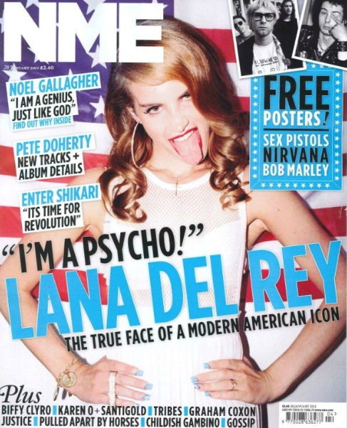
NME Magazine Contents Page:
NME's contents page fits the general conventions associated with music magazine contents pages - in particular music magazine contents pages for this genre. The page displays various features associated with the genre and also possesses the common conventions through use of text, images and layout.  

I will be exploring how the magazine cover represents the audience through Hall and Holmes' (1998) theory which stated: “Any media text is created for a particular audience and will usually appeal most to this particular target audience”. This theory will allow me to explore the audience's needs and desires through the magazine and it will also allow me to understand why specific fonts, images and colours are used.

Layout: NME's magazine cover is highly conventional in terms of layout and design - there are specific features on the page which relate to the audience and represent them to the best of their ability. 

This is done through the page being split into three specific sections - three columns which house three different areas of the contents page. This technique is used so that the contents page can be easily understandable and legible to the target audience - the layout allows for easy reading and for the eye to track certain areas on the page. The use of columns also allows the page to have a much more structural feel - this in turn represents the target audience's desire for a simple, easy to read magazine which doesn't make the eye concentrate on different areas at the same time. The target audience like this style of layout as the page is easy to read and only necessary information is in view. The layout of the page is conventional in terms of the genre and I will need to stick to these conventions when I come to create my magazine contents page. I will look at how this contents page is structured and also see how the columns allow the page to become broken up.

Use of text boxes also allows the page to become more structural - this allows the audience to have easy to read sections that are separated off from the rest of the page. Also, from a design perspective, this allows the page to have different sections of colour that break the page up in terms of information and design view. For example, the text box used at the bottom of the page, to show an advert for the magazine's subscription, is used so that this specifically contextually different section of the page is separate to the rest - allowing the eye to concentrate on the specific text sections. Text boxes are also used in the form of arrows connoting page turn over as well as referring to specific sections of text, allowing the page to appear more interesting as well as making it 'fun' and enjoyable to read.

Colours: 
This cover uses three main colours throughout the typography, text boxes and also images - these are black, white and red. These colours represent the target audience through themes regarding youth and also professionalism. The use of black connotes depression and rebellion two themes which relate to Stanley Hall's theory. These three colours also follow the colour palate and rule of three on the page - they also represent NME's logo and corporate colours. These colours make the contents page appear professional and also allows for a consistent theme throughout the magazine. I will use the three colour rule on my page to allow my page to seems professional and follow the conventions of others in the genre.

The target audience like this style because specifically coloured text and text boxes are specific colours - this allows certain sections to stand out and certain parts to become more noticeable than others.

Moreover, The use of yellow on the page allows certain text to stand out - this use of a fourth colour follows the conventions of magazine covers as well as allowing certain sections of the text to become broken up and separated - in this case it is done so that NME can advertise their product. 

Typography/masthead: 
Use of typography on the page allows text styles to differentiate as well as allowing relevant headings and bulk article font to represent different themes. To begin, the header font, indicating the contents title, follows on from NME's corporate font - this allows it to represent the magazine as well as allow the text to stand out. The masthead stands out because of the secondary text - used for sub-headings it is used so that certain parts of the article can become split as well as allowing this font style to stand out as well. Both of these fonts are bold which represents Stanley Hall's theory of 'rebellion' in youth. 

A final font is used for the majority of the article text - this represents common conventions in almost every magazine/newspaper and this allows the target audience to understand the importance and relevance of this text. Moreover, this text, due to it being a much finer, smaller text, allows for easy reading alongside making it easy to navigate. This 'finer' font is more easily read when used in an article which is why NME have used it. I will follow on from these typography techniques when I come to create my own magazine contents page. I will look at how NME have used bold fonts for headers to make them stand out and smaller finer fonts for smaller article text.

Images:
 Three images are used on this contents page. The first two are the main images – these images represents common conventions of magazine covers as they help to represent the audience and also allows the contents page to look attractive. It does this though the context of the image - the image represents the genre and the target audience's interests through what the image shows. This, in turn, allows for a page which is appealing and interesting, which is vital in a genre specific magazine. 

The third image is used to advertise the product - the image is used so the advert looks attractive as well as representing what the advert is trying to say without saying it. Images are imperative as it allows the audience to become engaged as well as allowing them to be representing through an interesting, engaging layout. The use of an image here helps to make the advertisement stand out, alongside the fact that the image stands out due to opposite shaded colours used in the image and the background. 

By exploring this magazine I can now see that I will now need to represent some of these key themes and theories in my own work - this will allow my magazine to build from Bentley's theory of 'rearranging the old to make the new'. By looking at this magazine's layout, colour scheme and images it has allowed me to gain an understanding of the market place as well as informing me of the key features and conventions required.

Lexis: The lexical choice by NME is relevant to that of almost all music magazines of the same genre. They have chosen language which grabs your attention, however language which is relevant to the genre and also relevant in terms of interesting the target audience. Language is used which is specific to the genre and often short, concise language is used which allows for easy reading. In places the language is informal and almost 'chatty' which invites the target audience to read on and become involved in the magazine. This in a sense connotes Stanley Hall's theory of rebellion as perhaps informal or chatty language is used in a published magazine. This kind of language is something which I will explore as I create my own magazine.

Kerrang! Magazine Contents Page:

Next I will analyse this contents page, taken from Kerrang! magazine, and explore it in terms of layout, colour, typography, lexis etc. By doing this, it will allow me to understand another magazine in the market place and the kinds of sections that I will be required to incorporate into my magazine's contents page.

Layout: 
The basic layout of this magazine contents page stays away from the common conventions associated with most music magazine contents pages. The idea of three columns of text is avoided as well as a large masthead and images balanced with text. However, to a certain extent this magazine contents page follows the target audience as well as the genre and the purpose of the magazine. The basic layout connotes youth and rebellion - this is key for the genre as well as representing the target audience. 

Use of text boxes, highlighted background sections and reverse colours allow the layout to work coherently despite straying away from stereotypical designs. Specific sections of the page have been highlighted so that certain sections of text can stand out from others. Moreover, use of text boxes allow important, however contextually different, sections of text stand out from others - this feature is similar to that used by many other magazines in the same market place, appealing to the same genre. 

Sections of text such as 'Contents' at the top of the page as well as 'Kerrang! this week' in the centre of the page have been incorporated into text boxes so that they stand out and help to make Kerrang!'s corporate colours stand out (white and yellow). Moreover, text boxes connote youth through easy to read, fun text and layout design - also it allows the page to connote the target audience through the colour which it possesses. 


The layout is something that I will be concentrating on when making my own magazine cover - I will be looking at Kerrang!'s magazine contents page so that I can create the best possible layout that I can. Moreover, I will be looking at how this layout portrays youth and also represents Stanley Hall's theory. 


Colours: Three main colours are used on this page - black, yellow and white. This follows the colour palate of the page and also the rule of three. These colours follow on from Kerrang!'s corporate colours and allow the page to look attractive. Moreover, use of red allows certain aspects of the page to stand out and look appealing. This also separates this section of the page and allows relevant text to be sectioned off in a sense so that it does its intended purpose. Rebellion is shown through Stanley Hall's theory throughout this page through use of colour - the dark colours signify depression which also links into Stanley Hall's theory.

Yellow is used on the page to highlight key words and headlines - this works well in terms of allowing it to stand out as it is instantly eye catching on first glance of the page. Moreover, the background colour of the text boxes intensifies this. Yellow also links back into the corporate colours and it connotes power, optimism and happiness which allow it to enhance the design, making it more attractive. Moreover, red is used at the foot of the page which connotes love, passion and also anger - this can all relate back to the target audience through stereotypes associated with a young audience. It also links into Stanley Hall's theory depression and rebellion in youth.

Typography/masthead: Various typography styles are used on this page which allows variety and also allows for an interesting layout. Moreover, the typography styles are relatively similar which allows the page to become consistent while also ensuring that it's not too similar or represents the wrong themes. An unconventional header is used in the company's corporate font to ensure that it looks correct. Despite it appearing in an unconventional area of the page, it represents the target audience through youth and rebellion. 

Two masthead style areas are incorporated onto the page - both use the same font and both have similar conventions. The first is the area that says 'contents' at the top of the page and secondly the area which reads 'Kerrang! this week'. These two sections of text represent different areas of the page however they don't represent the themes and conventions commonly required from a magazine of this type.

Different typography styles are used on the page so that it can become varied and also interesting to view. These styles are represented in different fonts and different areas to connote different meanings. The sub-heading text is very similar to that of the main header text - this allows the page to follow on from its own conventions while also creating a typography style which connotes lesser valued text. Finally, a typography style is used for the article text - this allows the ready to easily navigate the page and also read the text easily. Moreover, this text allows the page to connote professionalism as well as standard conventions of a magazine contents page.

Images: Image use on this contents page connotes youth and rebellion - this is key to the magazine's themes and also the genre. Unconventionally sized images are used so that the target audience can be represented - through stereotypes associated with youth. However, by not following on from traditional conventions, the magazine may lose a slight percentage of its audience. 

The images follow the colours of the page and allow the page to look attractive through use of colour and placement image placement. Colours such as black and white are shown through most of the image which is imperative to ensure the page stays consistent in terms of themes and design. Moreover, it allows the page to look attractive and stylish, while also representing the stereotypically rebellious target audience. Use of images also helps to break the page up in terms of allowing the text to have breaks as well as separating key sections. This is important to the target audience as it allows for easy reading on the page. 

Lexis/narrative: Specific word types are used throughout the contents page to represent the genre as well as the target audience. Moreover, they represent and connote the purpose of the magazine which is to inform as well as entertain. The page incorporates an engaging lexis which connotes informality and a friendly, welcoming feel - this is partly responsible for the success of the magazine. Relatively, however magazine and genre specific words are used to represents the magazine's purpose and audience. It also connotes an audience which wants to read something that can be quick, interesting and informative while not being overly complicated or long winded. 

By analysing Kerrang!'s magazine cover I have been able to understand the market place and also the types of magazine features which are successful and make a magazine cover look attractive and which don't. Moreover, I have been able to understand further into the interesting design and layout over the course of this page thanks to Bentley's (1997) theory which states 'The making of the new and rearranging of the old'. I will be exploring this magazine contents page when I come to create my own so that I can create something that represents the target audience as good as it can.

Q Magazine Contents Page:

Finally I am going to analyse a contents page published by Q magazine. This contents page is much more conventional in terms of layout which will allow me to have a broad understanding of conventional and unconventional features which can strengthen the integrity of a magazine's contents page. 

Layout: The layout of this magazine contents page follows similar conventions to that you would expect from a magazine of this nature. Columns are used alongside representation of text boxes, image layout and also general positioning of text.

To begin, use of columns on the page is integral to the magazine's popularity as it allows breaks in the information while also keeping it in a relevant, systematic order which allows for easy reading. In turn, this represents the audience through and an engaging design, the purpose through intention to engage the audience through contextual layout styles and also the genre through colours, text boxes and intention to lay the page out in a design which fits the audience's desires.

Text boxes are used in a widespread manor throughout the page which allows certain sections of text to become sectioned off, allowing easy reading. Moreover, these text boxes connote sophistication and a reasonably formal nature due to their size, positioning and colour. This allows the the page to thrive in terms of the genre and also the purpose - it represents the audience and allows the contents page to become a section of the magazine which engages the target audience and keeps them interested. 

Colours: A colour scheme is used in terms of a colour palate - three colours are primarily used which connotes music magazine's contents pages. Red, black and grey are used - grey and black connote depression whereas red connotes love, and in some cases youthfulness and rebellion. These colours represent the target audience through common conventions associated with them regarding Stanley Hall's theory which states that a common mood in teenagers is depression - this is strongly repented through use of black. 

The three main colours used on the page are represented throughout the background, the text boxes, the typography and also the images. Moreover, these colours are also represented through the logo in the top left of the magazine - this shows me that the colours are are the corporate colours of Q Magazine.

All of the colours used help to fit into the themes portrayed by the image surrounding them - all of the colours work well together and none of them make the page look odd or unattractive. This is imperative for the audience as it allows the page to have a theme which represents the magazine which they've purchased. Moreover, the features affected by colour help to enhance the page - making it something of popular desire. 

Typography/masthead: Q magazine's corporate typography is used for the masthead which is representative of not just magazines of this genre but also magazine in general. It is also positioned in a conventional place and is laid out in a conventional style - this regards the size of the typography, the colour in coherence with the rest of the page as well as the height that it is placed. The bold font allows the masthead to stand out and be noticed. It also allows the eye to be instantly drawn to it alongside a few other features. This is imperative as it allows the audience to understand what the page is instantly, keeping them engaged. The masthead also uses a similar font style to that of the sub headings - this allows for continuity on the page as well as allowing it to become an attractive typography style on the page in general. 

The typography used for the sub-headings allows certain sections of the page to relate back to the masthead along with the corporate fonts. The design idea to incorporate a typography style which relates back to the main header fonts is one which helps to allow the target audience to stay interested as well as represent the genre through generically laid out typography. 

Finally, the use of a third font for the main article text represents key generic themes represented in almost all forms of print media. There is a large difference between the font used for the header and the font used for the text in the article. This allows a for comprehensive difference in terms of viewing the page and understanding which sections apply to which header. Moreover, the colour of the text allows for easy to reading and connotes a formal magazine which appeals to a large audience. 

Images: Two images are used on this page which represents the target audience through Laura Mulvey's theory that women are only used in media for the sexual desire of men. Moreover, these image represent the genre, target audience and purpose. They help to connote the context of the page along with making it an interesting, attractive page to view. Moreover, the use of celebrity endorsement on the page appeals to the target audience through their interests and also what they want to see from a magazine contents page. This also relates to the purpose of the magazine which is to inform as well as entertain - this image informs the audience on what they're going to see in the magazine without reading any text. 

The images are the stereotypical size expected from a contents page of a magazine of this genre which allows for coherent reading as well as allowing the page to look attractive and appeal to the target audience. The colours used in the images also stick to those of the page, this allows the page to flow and stay within what's expected of a page of this style.

Lexis/narrative:
Sticking to convention as well as general stereotype, the lexis of the page follows the general friendly/informal feel which is inviting for the audience and helps to portray the genre through an engaging magazine style. Moreover, the lexis helps to represent the purpose of the magazine which is to inform the reader while keeping them entertained. Industry specific language is used which allows the reader to stay interested as well as represent the genre.

Through looking at this magazine I have been able to understand the key features used in popular music magazine and this also give me a clear idea of what is required in my magazine when I create it. I now have a clear understanding of what is required from a magazine of this type as well as what the target audience are looking for. This will help me when coming to design, take photos for and create my own magazine contents page.