Friday, 3 April 2015

Wednesday, 18 February 2015


Tuesday, 17 February 2015


Saturday, 17 January 2015
Cornwall Bys Vyken Website Construction

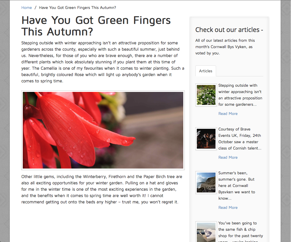
In order to create an aesthetically pleasing website design, I needed to ensure that during the construction I followed my flat plan designs and also looked at areas which I could build and expand on. I decided to use Dreamweaver throughout this process to ensure that I could efficiently create the design that I wanted. Before I started making my website, I create a new folder where I would keep all of my files, images, pages etc - this is so that I could link them all together, hassle free. By keeping all my files in the same folder I could find images and create links quickly.
I started by making a new website in Dreamweaver, I chose the page size I wanted and also filled in a range of different options which would affect the 'look' and style of my final product.

By following my design ideas I decided that I wanted a masthead at the top of the page, I formatted this in a 'CSS' format. By doing this I was able to choose the colour of my masthead and also pick the type styling. I used basic code to ensure that I added text boxes in the correct areas and chose the correct images and placed them in the correct areas too. I added graphics by using the split screen style design mode, where I was able to view editing code and also the layout design at the same time. I started to add my content, ensuring it was formatted correctly at the same time.

Before I started adding content, I made sure I had specific 'header' and 'footer' sections on my page - these areas are content specific areas which contain relevant text/images.

After I had added the basic content to my first page, I then started by making multiple pages. To do this, I duplicated my home page, renamed them and edited accordingly. I was then able to make other pages, however with the same design, ideas and styling. I worked on various pages, including article pages, the gallery, the contact page and also the about page.
After I had finished creating my website, I uploaded it with my domain name.


Thursday, 15 January 2015
Cornwall Bys Vyken Billboard Construction

I wanted to create a billboard design for my regional magazine in order to advertise it correctly and attract my target audience. This billboard design needed to be versatile and incorporate a design which would be able to be used in digital advertisement, conventional billboard advertisements as well as adverts used at bus stops, phone boxes and also in newspapers.
I decided, during the design process, that my advert needed to fit the conventions set by my magazine cover - therefore text placement, image type and also colour all needed to fit traditional and similar themes.

I started by opening a new document in Photoshop - I decided to use Photoshop because of the adaptable techniques and tools included. I wanted to create a PNG design as well as a JPEG - one would have a background image and the other would appear transparent. To do this, I imported a photograph which fits the themes required. I then used the pen tool to create a selection in a curved shape. This allowed me to cut out a spherical portion of my design. I also decided to add a thin white inside border line which would follow the perimeter of the design, adding stylistic themes.

Regarding typography, I experimented with the 'text' and 'paragraph' tools to create type which looks attractive and fits my design ideas. By using white it allows my text to stand out, and by aligning the size of the type so that it fits into a rectangle area, it allowed the advert to look attractive.

When editing my background image, due to me shooting the image in a RAW photo format, I was able to edit it in the RAW photo editor, making it easier to change colouring, lighting etc. I darkened specific areas, and changed points of colour so the image looked even more attractive and accentuated Cornwall's beauty - drawing in my target audience. I adjusted the 'levels', 'brightness', 'vibrance' and 'hue/saturation'.

To understand what my advertisement would look like in two possible locations, I edited two photographs so that I could create digital renditions of it in the real world. For the landscape advertisement, I added the background image to the back of the advertisement in the styling of black and white to give depth and create an attractive design.


Monday, 29 December 2014
Cornwall Bys Vyken Feature Page Construction

I decided that I wanted to create my feature page in InDesign to enable me to make good use of the 'alignment' tools, alongside the 'text' and 'paragraph' tools. Furthermore, I was able to utilise the 'border' tool as well as the 'crop tool'.
I started this process by making a new document in InDesign with two A4 pages, set up in 'spread' mode. Once I had created my document, I started by adding content, following my flat plan designs carefully to ensure I create a design which would appeal to my audience.

I started by adding images to my work - I used the 'links' panel to add images to my work. The use of the 'links' panel is important as this ensures optimum quality images, due to the fact that the images are linked together. I import my images and then placed them in the areas which fitted my original design. I cropped and resized accordingly. The 'alignment' tool allowed me to leave specific sized gaps between images, meaning they looked professional and fitted the aesthetically 'norm'.


After adding my images to my work, I then decided to work on the text. I used the 'text' and 'paragraph' tabs to ensure that my text was in the correct alignment, sizing and font. I was able to use 'bold' and 'italic' type styles to add journalistic techniques to my work. I decided to use 'Minion Pro' as this is was type style which fitted the theme of not only my magazine, however regional magazines in general.


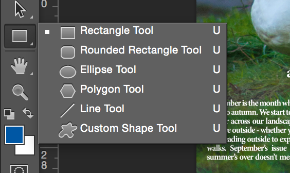
I then moved on to adding the border to my page. I created a large rectangle through use of the 'rectangle' tool - I filled this rectangle in the colour of white and added a border to it in the colour of black. I added a heavy weight to the border to make it thicker and then aligned the box with the whole page. Finally, I added the content of my article through use of the 'copy' and 'paste' tools, directly from Microsoft Word - this ensured that my work was spell checked and grammar checked. I added a larger first letter to the start of my article through use of the 'text' tools, this connoted traditional styles and also this genre of magazine. I experimented with paragraph style and chose one which allows my article text to fit in the box, aligned with both sides.

Tuesday, 16 December 2014
Cornwall Bys Vyken Contents Page Construction

I originally decided that I wanted to create my contents page in InDesign due to the alignment and text tools which were available. I started by editing an image which I felt suitable in the RAW photo editor in Photoshop. I then opened my image in InDesign through use of the 'links' panel. I also decided to add a grid to my document - this allowed me to align easily and also fit a layout scheme.
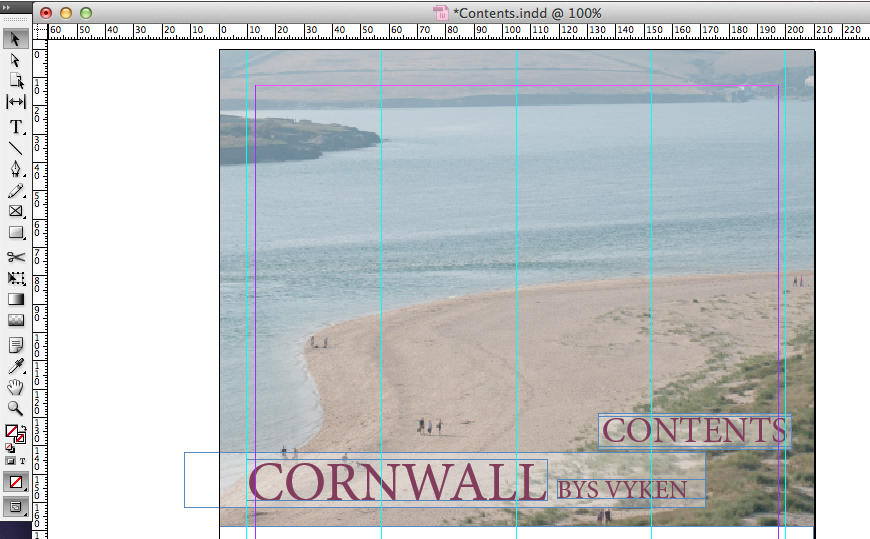 After adding a range of different content to my design, including images, text and other layout ideas, I decided that this design didn't look professional and fit the themes which I was hoping to achieve. Therefore, I decided to revert to an earlier design and start work in Photoshop instead, in hope that my design would work and look better.


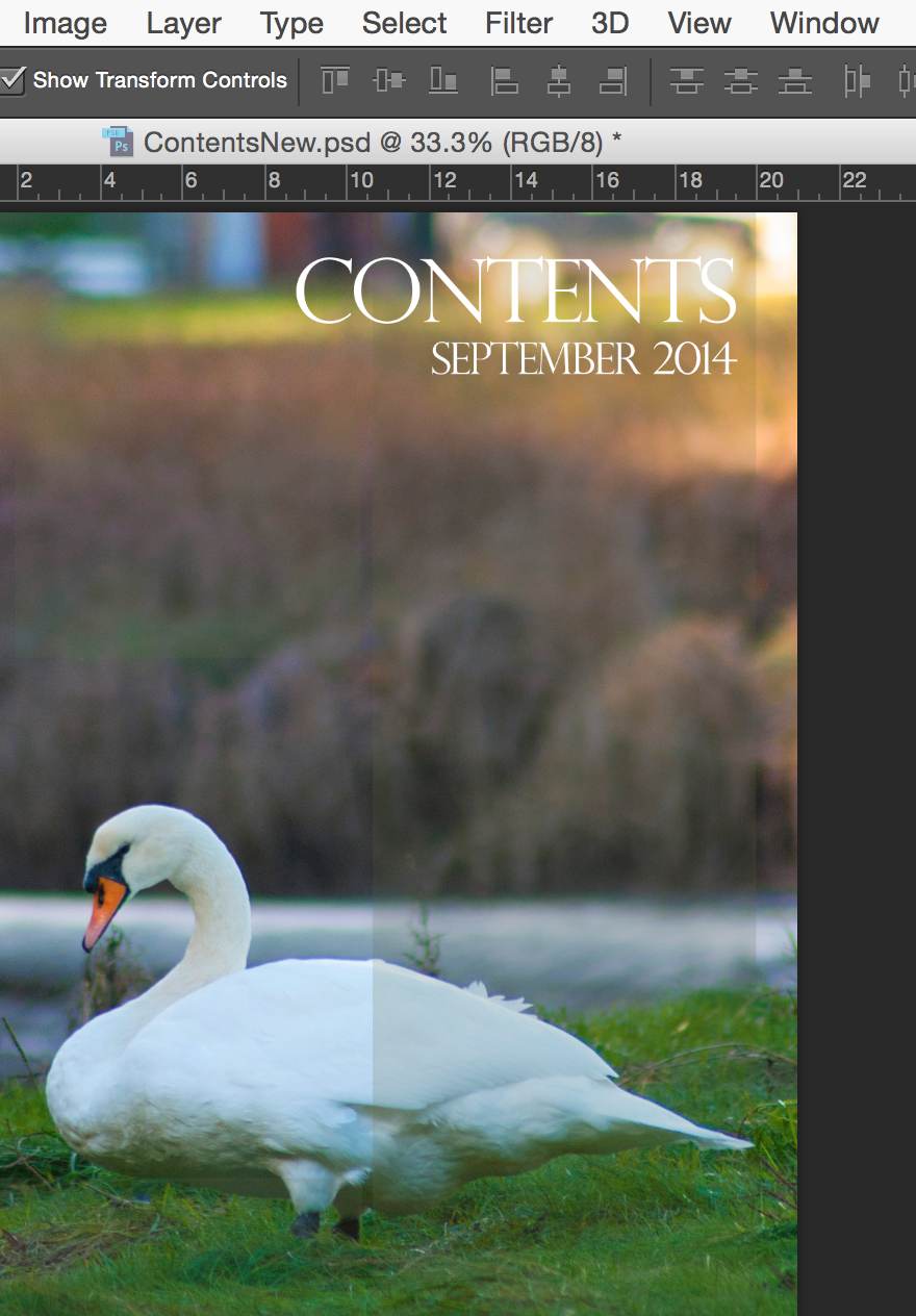
I started by creating my new design through adding an original image to my work - this image was took at Looe, Cornwall and fits the themes of regional magazines which regard natural wildlife photography. I next added a masthead to my page and used the 'text alignment' tool to align it to the right hand side. I hand picked a font which I thought look attractive and fitted convention. I then added a second line of text in a smaller font - I did this through the 'text' panel. I also added a rectangle behind my work and set it to a low opacity through use of the 'opacity' tool. This helped to lift the text off of the page and give my work a professional feel.
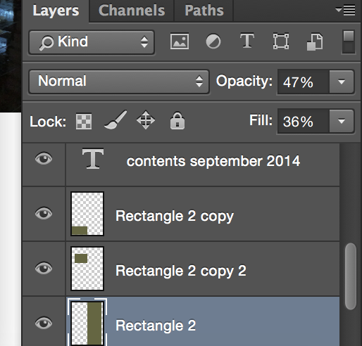
Through use of the 'layers' panel throughout this process, I was able to easily edit my layers and change various features about them. I changed the 'opacity' and 'fill' options on my rectangle to give it an opaque look, and it also gave an attractive filter over the top of my image. This would also come in handy later on as it would allow the rest of my contents' text to appear lifted off the page without using drop shadows, bevels or heavy looking text boxes behind my content.

Next, I decided to add article content to my work - I started by coping all of my articles and page numbers over from my previous contents page idea and then I formatted all of the content with specific ideas which would fit genre, audience and purpose.
I made the shorter article headings in a 'bold' or 'heavy' type style, and lesser information was in a 'regular' format. I ensured spacing and alignment was correct and and all of my text sizing matched - I did all of this through the 'text' and paragraph panels.


I finished my design by adding another rectangle (I copied the one that I had previously made to ensure I had the correct styling). I then created a heading in lower case text to connote personality and informality. I then created a paragraph of text which fitted that of other regional magazines and aligned it to the right hand side through use of the 'paragraph' tool.

Subscribe to:
Posts (Atom)