
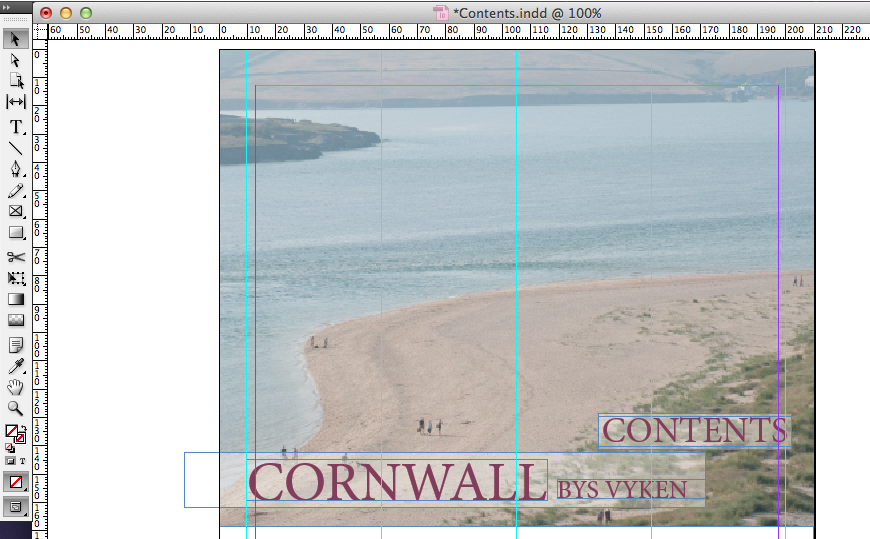
I originally decided that I wanted to create my contents page in InDesign due to the alignment and text tools which were available. I started by editing an image which I felt suitable in the RAW photo editor in Photoshop. I then opened my image in InDesign through use of the 'links' panel. I also decided to add a grid to my document - this allowed me to align easily and also fit a layout scheme.
 After adding a range of different content to my design, including images, text and other layout ideas, I decided that this design didn't look professional and fit the themes which I was hoping to achieve. Therefore, I decided to revert to an earlier design and start work in Photoshop instead, in hope that my design would work and look better.


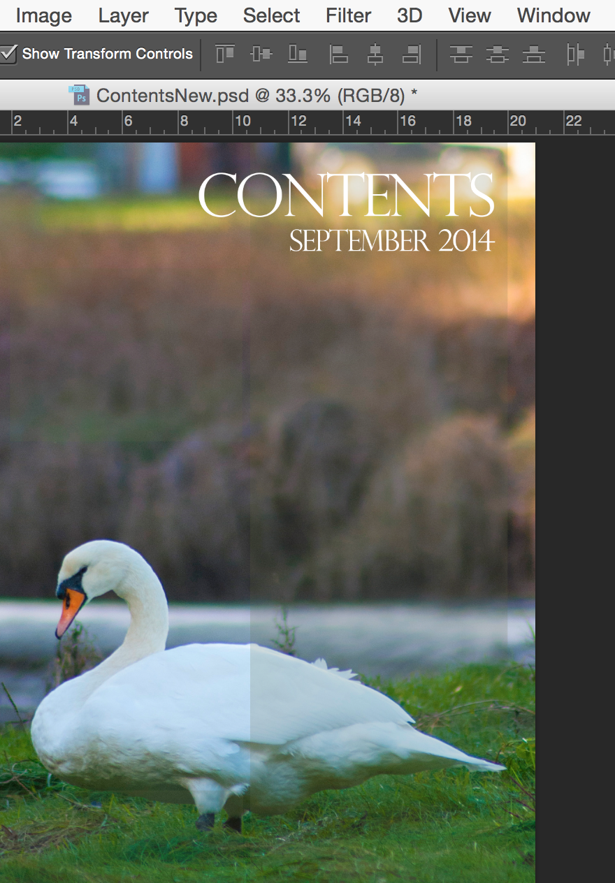
I started by creating my new design through adding an original image to my work - this image was took at Looe, Cornwall and fits the themes of regional magazines which regard natural wildlife photography. I next added a masthead to my page and used the 'text alignment' tool to align it to the right hand side. I hand picked a font which I thought look attractive and fitted convention. I then added a second line of text in a smaller font - I did this through the 'text' panel. I also added a rectangle behind my work and set it to a low opacity through use of the 'opacity' tool. This helped to lift the text off of the page and give my work a professional feel.
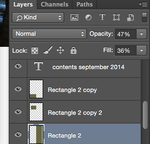
Through use of the 'layers' panel throughout this process, I was able to easily edit my layers and change various features about them. I changed the 'opacity' and 'fill' options on my rectangle to give it an opaque look, and it also gave an attractive filter over the top of my image. This would also come in handy later on as it would allow the rest of my contents' text to appear lifted off the page without using drop shadows, bevels or heavy looking text boxes behind my content.

Next, I decided to add article content to my work - I started by coping all of my articles and page numbers over from my previous contents page idea and then I formatted all of the content with specific ideas which would fit genre, audience and purpose.
I made the shorter article headings in a 'bold' or 'heavy' type style, and lesser information was in a 'regular' format. I ensured spacing and alignment was correct and and all of my text sizing matched - I did all of this through the 'text' and paragraph panels.


I finished my design by adding another rectangle (I copied the one that I had previously made to ensure I had the correct styling). I then created a heading in lower case text to connote personality and informality. I then created a paragraph of text which fitted that of other regional magazines and aligned it to the right hand side through use of the 'paragraph' tool.

No comments:
Post a Comment