Monday 29 December 2014

Cornwall Bys Vyken Feature Page Construction

I decided that I wanted to create my feature page in InDesign to enable me to make good use of the 'alignment' tools, alongside the 'text' and 'paragraph' tools. Furthermore, I was able to utilise the 'border' tool as well as the 'crop tool'.

I started this process by making a new document in InDesign with two A4 pages, set up in 'spread' mode. Once I had created my document, I started by adding content, following my flat plan designs carefully to ensure I create a design which would appeal to my audience.


I started by adding images to my work - I used the 'links' panel to add images to my work. The use of the 'links' panel is important as this ensures optimum quality images, due to the fact that the images are linked together. I import my images and then placed them in the areas which fitted my original design. I cropped and resized accordingly. The 'alignment' tool allowed me to leave specific sized gaps between images, meaning they looked professional and fitted the aesthetically 'norm'.


After adding my images to my work, I then decided to work on the text. I used the 'text' and 'paragraph' tabs to ensure that my text was in the correct alignment, sizing and font. I was able to use 'bold' and 'italic' type styles to add journalistic techniques to my work. I decided to use 'Minion Pro' as this is was type style which fitted the theme of not only my magazine, however regional magazines in general.


I then moved on to adding the border to my page. I created a large rectangle through use of the 'rectangle' tool - I filled this rectangle in the colour of white and added a border to it in the colour of black. I added a heavy weight to the border to make it thicker and then aligned the box with the whole page. Finally, I added the content of my article through use of the 'copy' and 'paste' tools, directly from Microsoft Word - this ensured that my work was spell checked and grammar checked. I added a larger first letter to the start of my article through use of the 'text' tools, this connoted traditional styles and also this genre of magazine. I experimented with paragraph style and chose one which allows my article text to fit in the box, aligned with both sides.


Tuesday 16 December 2014

Cornwall Bys Vyken Contents Page Construction

I originally decided that I wanted to create my contents page in InDesign due to the alignment and text tools which were available. I started by editing an image which I felt suitable in the RAW photo editor in Photoshop. I then opened my image in InDesign through use of the 'links' panel. I also decided to add a grid to my document - this allowed me to align easily and also fit a layout scheme. 


After adding a range of different content to my design, including images, text and other layout ideas, I decided that this design didn't look professional and fit the themes which I was hoping to achieve. Therefore, I decided to revert to an earlier design and start work in Photoshop instead, in hope that my design would work and look better.

I started by creating my new design through adding an original image to my work - this image was took at Looe, Cornwall and fits the themes of regional magazines which regard natural wildlife photography. I next added a masthead to my page and used the 'text alignment' tool to align it to the right hand side. I hand picked a font which I thought look attractive and fitted convention. I then added a second line of text in a smaller font - I did this through the 'text' panel. I also added a rectangle behind my work and set it to a low opacity through use of the 'opacity' tool. This helped to lift the text off of the page and give my work a professional feel. 


Through use of the 'layers' panel throughout this process, I was able to easily edit my layers and change various features about them. I changed the 'opacity' and 'fill' options on my rectangle to give it an opaque look, and it also gave an attractive filter over the top of my image. This would also come in handy later on as it would allow the rest of my contents' text to appear lifted off the page without using drop shadows, bevels or heavy looking text boxes behind my content. 

Next, I decided to add article content to my work - I started by coping all of my articles and page numbers over from my previous contents page idea and then I formatted all of the content with specific ideas which would fit genre, audience and purpose. 

I made the shorter article headings in a 'bold' or 'heavy' type style, and lesser information was in a 'regular' format. I ensured spacing and alignment was correct and and all of my text sizing matched - I did all of this through the 'text' and paragraph panels.


I finished my design by adding another rectangle (I copied the one that I had previously made to ensure I had the correct styling). I then created a heading in lower case text to connote personality and informality. I then created a paragraph of text which fitted that of other regional magazines and aligned it to the right hand side through use of the 'paragraph' tool. 

Cornwall Bys Vyken Cover Page Construction


I started this process by creating a new A4 document in Photoshop - I did this by going FILE>NEW DOCUMENT, the renaming the document and picking the page size. Next I picked out an image from a photo shoot at Rock in Cornwall. I edited this image by using the RAW Photo editor in Photoshop - this was due to the fact that I had shot the image in a RAW photo format, meaning the image was of the highest quality. After having edited the image I when experimented by adding a masthead ideas through use of the 'text' and 'type' tools. I also added a rectangle through use of the 'rectangle tool' and 'filled' it in the colour of white. I used the 'swatches' tool to do this. 


I edited my masthead through use of the 'layers tool' - here I could change the styling regarding the bevel of my text. I also changed the colour and sizing through use of the 'text' tool. I also experimented with smaller article text on the page and played around with type styles and fonts.


I decided, after this, that I wanted to take a different approach to my cover design - I felt the cover image wasn't of optimum quality and it didn't give off the same professional feel which I felt was needed. Therefore, I decided to go for a different cover design idea and added a different cover image which I had took at Looe - the same location as my contents page image and therefore the same themes. I felt this image fitted the genre themes and looked attractive - the kind of image which would grab my audience's attention. 


I decided to copy over my previous masthead as I felt this particular piece of styling fitted my chosen themes and looked attractive. The colour of grey in the image allows the text to stand off from the background image and this is accentuated by the 'bevel' feature added.

I then decided to add top and bottom graphics to my page - the top I copied from my previous design and I created the bottom one with the same techniques. By using capital letters it makes these sections stand out and the colouring I used, I created by using the 'fill' tool. I changed the shape and size by using the sizing areas in the corners of the rectangles.


Next, I decided to add more text to my work, I played around with type styles, colouring and alignment by exploring the 'text' and 'paragraph' tools at the side of the page. I added relevant articles and colour coded specific parts to make text stand out and grab my audience's eye. I also made my text in capital letters to make it stand out. I added a slight drop shadow on my text to lift it off of the page and give a three dimensional feel/make it easier for my audience to read the text. I did this by exploring the 'layers' menu, where I could edit the layer styling. 

After I had finished this, I added a barcode to my work - I also added the price in small writing underneath, as well as the month of issue. I also went on to add a corner-style graphic as shown below. I did this by creating a rectangle by using the 'rectangle tool'. I then utilised the 'pen tool' and removed one of the points from the rectangle. I then resized the object and layered text over the top by using the text tool and the rotate tool. I also changed the colour of the rectangle by picking a suitable colour and full filling the colour scheme of the page. I used the 'swatches' tool and also the 'fill' tool to put this into practise. The processes and tools I used are all shown below. 


Saturday 13 December 2014

Magazine & Website Draft Articles

Feature Page:

Average Homes For Extortionate Prices?
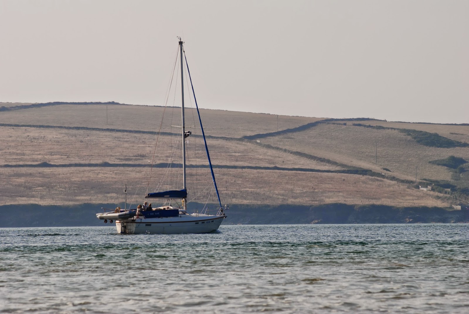
Rock and Polzeath are at the forefront of our attentions when mentioning extortionate house prices in Cornwall. By spending only 5 minutes in the company of John Bray’s Estate Agents, this soon becomes clear, as the term ‘paying for a view’ strikes us with nine digit figures.

A short stroll around the north Cornwall area perfectly presents how Cornwall is at the pinnacle of over prices houses. A walk down Rock’s Rock Road or Polzeath’s Cliff Lane tells the whole story. Prices no lower than seven hundred and fifty sets the tone. Upwards from that sees one million, two million and three million pounds, prices that only those on a six figure income could set their eyes upon.

Houses owned by the likes of Fatboy Slim’s manager, the author of Fifty Shades of Grey, along with many other top name celebrities, has pushed up the house prices in Cornwall due to popularity and following celebrity influences.

Other names mentioned when exploring celebrity interest in Cornwall are Kate Moss, David Cameron and Harry Enfield, who have all been known to holiday in the local area.

Holiday homes add to the local frustration - homes occupied maybe one to two weeks a year, by millionaire business owners. Beautiful homes, homes overlooking seaside locations, homes which, if owned by locals, could be enjoyed to their maximum potential.

The demographic of Cornwall’s seaside towns is quickly changing. House prices have had a cascading affect on many other areas of society in our county. Many locals are left ‘blown away’ by how many people in their local area who they don’t know, as appose to twenty to thirty years ago. Furthermore, For this demographic this is a real issue, an issue which needs to be tackled. Whether that’s through a cap on housing prices or a deterrent for expensive businessmen, who drive up house prices. Nevertheless, Rock & Polzeath will always be at the forefront of my heart when it comes to Cornwall.

Website Articles:

The Road To Rio Starts Now
Courtesy of Brave Events UK, Friday, 24th October saw a master class of Cornish talent in the form of 'Road To Rio' – a fundraising event, with all funds going towards budding musician and World Champion from Bodmin, Daniel Puckey. An evening with music supplied from local wedding band, CoverCollective, Joe Deakin, Ollie Brown and Daniel Puckey himself.

With the stage set, cameras at the ready and a strong line up of top quality musicianship, The Road to Rio was looking like another success from Brave Events. With the absence of Cornish superstars, HitPinch, the night got underway with a bang as each act stepped up in front of the warm, welcoming audience. Up first was young guitarist, come vocalist, Ollie Brown. He set the stage alight with a range of fantastic renditions of modern pop and indie tracks. Taking to the stage like a duck to water, he grabbed our hearts from the moment he strummed his guitar.

We soon parted ways with Ollie as Joe Deakin blessed us with his school boy charm and wit as he performed a range of cover material as well as some of his own lyrical musicianship. With his own individual style and sound, he wowed all the way throughout his set of 6 pieces. Despite Joe's excellence, the main event was still to come - the man who the evening was all in aid of.

Daniel Puckey graced the stage next, presenting us with an exciting mix of traditional 'Gypsy Jazz' and Daniel's own creation which he's proudly named, 'Lap Tapping'. Layering riffs over on his 'pedal', we saw just a glimpse into how this young musician has developed and adapted over his years practising. After a professionally welcomed set, Daniel made way for his wedding band, 'CoverCollective', who wrapped up the evening. Playing a set comprised of pop and rock numbers, they closed the show with a bang as a standing ovation, followed by an encore, closed the evening aptly.

Another successful evening of music, brought to us by Brave Events UK, was surely the highlight of everybody's music year. 

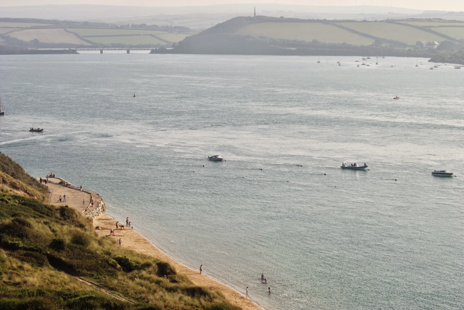
Cornwall, But What Beach? The Top 10 Count Down
Summer's been, summer's gone. But here at Cornwall Bysvken we want to know which of our beautiful beaches graces our coastline in the most honourable style. With beaches specialising in surf, others being popular with the dog walker, and even some which are perfect for a sunbathe in the summer sun, which beach really is the perfect beach in Cornwall. We will be counting down our top 10 favourite beaches, as we strive to find out which has the biggest 'wow' factor.

6) Whitsand Bay: a long sandy beach which offers good swimming conditions and excellent surf - definitely makes our top 10.
5) Godrevy Beach: a three mile-long sandy beach with excellent views and great facilities.
4) Praa Sands: medium, sandy beach in a sheltered section of our South coast.
3) Penhale Sands: a typical seaside location with good surf and lifeguards on regular duty
2) Porthcurno Beach: good protection from prevailing winds and excellent surf!
1) Mawgan Porth: a large sheltered bay with generally good surf - excellent landscape and it has to make our top spot.

The Fish & Chip Lifestyle
You’ve been going to the same fish & chip shop for the past twenty years – you’re looking for something else. Well by stepping outside of your home town you can find a vast array of quality ‘fast fish’ all over the county. With slightly more eloquent cuisine being served up at Rick Stein’s, or your classic corner shop take away, you don’t have to dive far to reach a shop which you’ll soon fall in love with.

Stepping inside a new chippy is an exciting feeling, not knowing whether the chips are too dry, or batter too thick is an adrenaline rush at its finest. However we have been discovering your favourite shops across the county. Topping our list is of course Stein’s fish & chips, located in Falmouth – a no brainer for some maybe. However two other names on our list which grabbed our attention were Beck’s Fish and Chips, St Ives and Lewis’s at Newlyn – we’ll certainly be trying them out, will you?

Have You Got Green Fingers This Autumn?
Stepping outside with winter approaching isn’t an attractive proposition for some gardeners across the county, especially with such a beautiful summer, just behind us. Nevertheless, for those of you who are brave enough, there are a number of different plants which look absolutely stunning if you plant them at this time of year. The Camellia is one of my favourites when it comes to winter planting. Such a beautiful, brightly coloured Rose which will light up anybody’s garden when it comes to spring time. 

Other little gems, including the Winterberry, Firethorn and the Paper Birch tree are also all exciting opportunities for your winter garden. Pulling on a hat and gloves for me in the winter time is one of the most exciting experiences in the garden, and the benefits when it comes to spring time are well worth it! I cannot recommend getting out onto the beds any higher – trust me, you won’t regret it.

Friday 12 December 2014

Original Images

I decided to take a range of images which fitted the genre themes and styling ideas set by current media producers e.g. Cornwall Today. I needed to take quality photographs of attractive landscape settings, as this would grab my audience's attention and subliminally convince them to buy my magazine. I picked a range of shot types, however, conventionally, cover shots typically show a long range landscape image - common subject types are rivers/estuaries, coastal photographs, rural landmarks and moorland photography. I decided that I wanted to shoot my images at two main locations - regarding the subject of my images, this would allow me to cover a diverse range of photography, meaning that when I come to create my practical work, I am able to pick the most suitable images. The two different photoshoots which I covered were around the Looe area, as well as Rock beach and harbour.

Below are a selection of photos from my first landscape based photoshoot in Looe, Cornwall. 


This photoshoot went successfully in terms of the amount of shots I got, the range of shot types, and also the quality of the images. The images which I took, all explore similar themes in terms of genre, audience and purpose representation. I have explored themes set by current media producers, in order to create a final product which is appealing to my specific target audience. I have mainly explored the use of the 'long shot' type, as this fits convention - however, I have also played around with use of close-ups and medium close-ups. This range of shot types will allow for my magazine to fit stereotypes and also present a medium which will fit the idealistic nature for a regional magazine to inform and entertain. 

To add to my current portfolio of images, I decided to undertake another photoshoot. I visited Rock in Cornwall to take a selection of images which would compliment and also contrast from my previous shoot. 

Regarding the success of my second photoshoot, I feel that this photoshoot didn't fulfil the same standard of work as my previous shoot did. This is down to a number of different factors. Despite the location, shot type and also camera quality, due to the haziness of the images I may be unable to use a selection of them. I may still be able to use some of the images from this shoot however, for instance when creating smaller article sections and extra articles.