
I started this process by creating a new A4 document in Photoshop - I did this by going FILE>NEW DOCUMENT, the renaming the document and picking the page size. Next I picked out an image from a photo shoot at Rock in Cornwall. I edited this image by using the RAW Photo editor in Photoshop - this was due to the fact that I had shot the image in a RAW photo format, meaning the image was of the highest quality. After having edited the image I when experimented by adding a masthead ideas through use of the 'text' and 'type' tools. I also added a rectangle through use of the 'rectangle tool' and 'filled' it in the colour of white. I used the 'swatches' tool to do this.
I edited my masthead through use of the 'layers tool' - here I could change the styling regarding the bevel of my text. I also changed the colour and sizing through use of the 'text' tool. I also experimented with smaller article text on the page and played around with type styles and fonts.


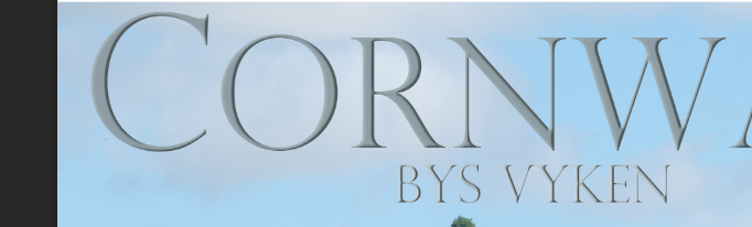
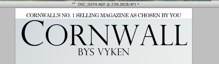
I decided to copy over my previous masthead as I felt this particular piece of styling fitted my chosen themes and looked attractive. The colour of grey in the image allows the text to stand off from the background image and this is accentuated by the 'bevel' feature added.
I then decided to add top and bottom graphics to my page - the top I copied from my previous design and I created the bottom one with the same techniques. By using capital letters it makes these sections stand out and the colouring I used, I created by using the 'fill' tool. I changed the shape and size by using the sizing areas in the corners of the rectangles.
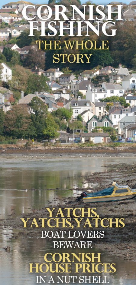
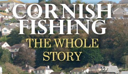 Next, I decided to add more text to my work, I played around with type styles, colouring and alignment by exploring the 'text' and 'paragraph' tools at the side of the page. I added relevant articles and colour coded specific parts to make text stand out and grab my audience's eye. I also made my text in capital letters to make it stand out. I added a slight drop shadow on my text to lift it off of the page and give a three dimensional feel/make it easier for my audience to read the text. I did this by exploring the 'layers' menu, where I could edit the layer styling.
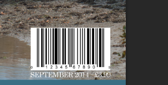
After I had finished this, I added a barcode to my work - I also added the price in small writing underneath, as well as the month of issue. I also went on to add a corner-style graphic as shown below. I did this by creating a rectangle by using the 'rectangle tool'. I then utilised the 'pen tool' and removed one of the points from the rectangle. I then resized the object and layered text over the top by using the text tool and the rotate tool. I also changed the colour of the rectangle by picking a suitable colour and full filling the colour scheme of the page. I used the 'swatches' tool and also the 'fill' tool to put this into practise. The processes and tools I used are all shown below.


• There is excellent research into similar products and a potential target audience.
ReplyDelete• There is excellent work on shotlists, layouts, drafting, scripting or storyboarding